Papa John's unveil their new branding
Pizza franchise Papa John’s has unveiled a new look to its branding with the refresh of the Potters Bar store.
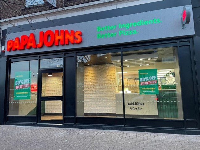
The updated logo takes out the word "pizza" and removes the green border around "Papa John's." It is replaced simply with: "Papa Johns" in block red letters. The logo also loses the possessive apostrophe resulting in a fresh modern feel.
“We are excited to introduce a new look to our branding which will be gradually rolled out across our 500 plus stores in the UK, starting with Potter Bar. The changes are designed to refresh the brand to give it a fresh bold look and feel and also to illustrate our quality ingredients even better.”
Amit Pancholi, Business Development Director Papa John’s UK confirms:
Advertising and messaging will now use an updated colour palette inspired by Papa John’s ingredients, including green for basil, red for Papa John’s signature tomato sauce and white for dough.
Amit Pancholi continues: “We love the new fun, friendly font which is welcoming and ‘inspired by our stretchy dough’. We will also draw more attention to our fresh ingredients which will be highlighted in photos in stores.”